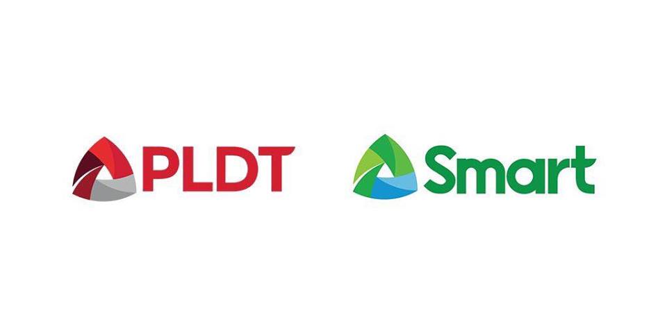
The Philippine Long Distance Telephone Company (PLDT) and its wireless unit Smart Communications unveiled their newest logos in their “It’s a New Day for PLDT-Smart” event.
PLDT’s expertise in fixed-line business is said to be marrying Smart’s wireless competency. The said fusion of the two brands is perfectly visible in their newest logos.
“The new logo symbolizes the powerful convergence of PLDT and Smart, combining fixed and wireless technologies to serve individual and enterprise customers,” PLDT said in a press statement.
This is the first time that PLDT is replacing its 33-year old iconic logo. Smart, on the other hand, replaced a fairly new one launched last 2011.
“Rather than allow ourselves to be disrupted by new technologies, we are disrupting ourselves. We have embarked on a digital pivot to enable us to serve the increasing needs of our people’s digital lifestyle and the country’s growing digital economy,” PLDT and Smart Chair and CEO Manuel V. Pangilinan said in a press release.
And how do netizens react to this move? As usual, some are taking it to memes just like this:
Others commented that it’s kind of derived from Google Drive’s logo. Any other reactions? Feel free to share it in the comment section below.
- Phishing Email Analysis Landing Page - September 19, 2024
- BPI to hold Cybersecurity Conference to ‘Fortify Cyber-Resilience in an AI World’ - July 25, 2024
- New Smishing Campaign makes use of Globe SMS Sender ID - May 27, 2024

